|
Seventy-Nine Color Notes for Artists by John Passaro (c) 2022 John Passaro
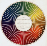
Feel free to use these writings for your own personal use and tell others if you like. Please don't copy this work, however, and publish it under your name: that wouldn't be right, aside from bringing up the point that it wouldn't be legal! On the other hand, there is nothing here that wasn't mentioned to me by my teachers and wasn't mentioned to them by their teachers and their teachers before that. I learn a lot by experimenting and working on my own, but, as far as I know, I haven't discovered anything on my own which wasn't discovered by other artists working on their own, or couldn't have been known to me by asking my teachers if I had known the question to ask. The wheel of artistic knowledge is timeless. 1. Black is a color, it is not something to darken other colors with. Treat black like any other color on your palette. 2. White is a color, it is not something to lighten other colors with. Treat white like any other color on your palette. 3. Black is not black. Black is either a very dark-valued blue or a very dark-valued brown. The commonly available choices in artist paints these days are ivory black, bone black, lamp black, and mars black, with some vine black around and about. The best way to tell which is warm and which is cool is to place them next to one another on a piece of glass or white paper and pull them out with a palette knife. They may be difficult to tell which is cool and which is warm individually, but in comparison it becomes very clear. (Note: there is a big HOWEVER attached to this . . . the label on the tube may say one thing and the actual pigment list elsewhere on the tube may say another.) 4. Learn to read pigment lists. None of the big artist paint manufacturers makes black out of charred and ground ivory tusks any more. Ivory black is really made of charred animal bones (PBk9, which is pigment black number nine), which is why it is sometimes labeled bone black. Or is it? Some manufacturers use carbon black (PBk6) and call it ivory black or bone black. Most of us think of lamp black as being carbon black. You can probably figure that lamp black isn't made from the carbon left behind on the glass flutes of Egyptian oil lamps. Mars black is the one black that seems to be consistently labeled; it is PBk11 and is an inorganic pigment made from synthetic black iron oxide. In most cases, these various technicalities are merely interesting; in some cases it can be crucial to mixing the color you want, or to avoiding the frustration of fighting with your colors when you mix paints. 5. Some artists, in an effort to please their teachers and imitate the Impressionists, have blacklisted black (sorry about the pun). I suggest experimenting with black. If it was good enough for everyone from the cave artists in prehistoric times through the greatest of the Russian landscape artists, maybe there's something to it. 6. Use black pigment (ivory, bone, mars, lamp, vine) in a painting only if it's included from the beginning as one of the colors on your palette for that particular painting. 7. When you need black for your painting and it hasn't been integrated as part of your palette for that particular painting from the beginning, decide whether you need a warm or cool black and then mix it out of the dark-valued colors on your palette you are using in that particular painting. This helps preserve/achieve color unity. 8. White is not white. White is a very light-valued blue. When you add white to a color you are adding blue, which is why when you are reaching for those intense warm high notes, white is the last color you want to use. 9. Some say white is the absence of color; I suggest to you that there is no absence of color except in the theoretical world. In the real world, very light-valued colors, even the lightest values which we think of as whites, are colored by reflections and light. 10. A centuries-old trick of artists, demonstrated to me by one of my teachers, is to lightly crumple a sheet of white paper and throw it into the light you are working in (indoors or outdoors) and see whether the paper shows cool blue light or warm yellow light. 11. Sometimes, especially indoors, the color of light may vary. Your subject may be bathed in warm light from the incandescent or halogen lights in your studio on one side and cool natural northern light on the other side. Very interesting. 12. In any event, color is not color, it is color relationships: a color we think of as cool by itself, may be perceived as anything from cool to warm depending on the other colors in the painting. 13. Once you begin thinking of color relationships, give color unity a chance in place of color harmony. It may seem like semantics, but give it a try. 14. If white is not white and black is not black, you can probably figure that brown is not brown; brown is either a dull yellow like Naples yellow and yellow ochre or a dull red like burnt sienna or a red iron oxide. 15. When using brown, identify the warmth or coolness of the pigment and proceed accordingly. For instance, a good Venetian red is warm with orange, and a good Indian red is cool with blue. Burnt umber is warm and raw umber is cool. 16. By the way, when used as an integrated part of a painting from the beginning, Venetian and Indian reds make some fascinating, rich grays. 17. Maybe the following statement should have been at the top of the list, but I thought a nice warm-up discussion of black and white and the earth colors might be a good lead-in to: There is no such thing in the world of artists pigments as primary red, primary yellow, or primary blue. 18. The theoretical color wheel is nearly useless to artists because there are no primary colors in artist tubes. 19. All our reds are either yellow-red like the cadmiums or blue-red like anthraquinone; our yellows are orange-yellow like cadmium or green-yellow like the arylides, our blues are either red-blue like ultramarine or green-blue cerulean. 20. Here's a daring thought: there is no such thing as color; there is only warm and cool. 21. Here's another daring thought: there is no such thing as a colorful painting, only warm paintings and cool paintings. 22. You will do yourself an enormous favor if before starting a painting you decide whether the painting is meant to be a cool painting with some warm areas in it or a warm painting with some cool areas, then stick to it. 23. Yellow is either warm yellow like a cadmium or cool yellow like an arylide. 24. Red is either warm red like a cadmium or sometimes napthol or cool red like anthraquinone or sometimes napthol. 25. Blue is either warm blue like cobalt (sort of!) or cool blue like French ultramarine. 26. Make your own color wheel out of your own colors which you use in your work. 27. Tilt the traditional color wheel so that the warm colors are on top (above the equator if you will) and the cool colors below (in the southern hemisphere). I owe this particular innovation to a brilliant teacher of mine named Doug Dawson. 28. To mix color accurately, decide the basic color, yellow, red, blue, then get the value right, then warm your mixture up or cool it down. Readjust the value if necessary. 29. To intensify your cadmium reds, don't add white, add yellow, and don't add an arylide yellow, add another warm yellow like another cadmium. 30. To intensify your yellows, do nothing; change the relationships around the yellow. 31. If you need to add white to yellow to get the relationship you are looking for, maintain the intensity by adding just a little white. White is blue. Blue and yellow make a dull color. 32. You will find that, when mixed with white, the arylides hold their intensity better than cadmium yellow. 33. To intensify ultramarine, lighten the value to bring out the color. White is blue; white is compatible with ultramarine up to a point. Use white through the top value ranges, then use cobalt through the middle ranges where possible, then switch back to white for the lightest values. 34. Intense color usually attracts the eye, and can therefore be used to help direct the viewer's path through a painting. 35. High-intensity-color paintings are garish to some artists like classical painters. 36. High-intensity-color paintings are expressive to some artists like the Fauves. 37. Artists and critics have been debating the proper use of color since at least the Chinese thousands of years ago. For all we know the cave painters might have debated among themselves about how much of that garish yellow earth was appropriate in relationship to their carbon black out of the fire and their refined oxide reds. 38. Most everyone in history and most today seem to agree that color can be very appealing. 39. Here's an unsettling corollary of the above: only you can decide for yourself when you are expressing yourself in a way nothing but color can accomplish and when you are playing on the emotional appeal of color. 40. Unsettling corollary number two: only you can decide for yourself whether there is anything right, wrong, or otherwise about playing on the emotional appeal of color. 41. Make your own color wheel out of your own colors you use in your work. 42. Tilt the traditional color wheel so that the warm colors are on top (above the equator if you will) and the cool colors below (in the southern hemisphere). I owe this particular innovation to a brilliant teacher of mine named Doug Dawson. 43. Unsettling corollary number three: there may be different answers for different paintings. Unfortunately, in art, general rules tend to break down when they come in contact with individual artistic needs. 44. No color is any color by itself. Color exists for artists only in relationship to the colors around it. Rembrandt could make a cool black look green by building color relationships. I'm not saying that's a good or bad thing, only that every artist should have that skill in the bag. 45. Intensity is a relationship. Place a small square of unadulterated cadmium red in a field of dull Naples yellow and yellow ochre and blue-gray and so on and it will look very intense. Place the same patch in a sea of cobalt and cadmium yellow and you won't notice it. 46. If you are aiming toward an intense effect, save the effect for a very, very small area of the painting and dull everything else around it down. If you are successful, a good artist will compliment you on using "just the right amount" of intense color in that sunset (for instance). 47. We cannot hope to compete with nature, only to imitate its effects as best we can. 48. To imitate the vibrations of the sky, for instance, lay down clean mixtures of warm and cool colors in exactly the same value. 49. Same-valued colors will vibrate in the eyes of the beholder. If you can't control the value, you will lose the imitation. 50. There is no such thing as a flat unvaried patch of color in nature. It doesn't make a difference what the subject is, still life, figure, landscape, and so on, there are no flat areas. Look very, very closely and you will see many variations. 51. You will imitate this effect in nature by not over-mixing your paint. Let the paint gather on the brush and lay it down without thoroughly mixing it. One brushstroke can contain many variations . . . like nature. 52. The Impressionists did not invent optical mixtures; that is, placing one color next to the other and letting the eye of the beholder mix the colors; they focused on color relationships that are spatially close together, that's all. 53. Your high-profile brushstrokes, if you use them will affect your colors and values by catching and reflecting the light in the ridges. Don't underestimate this effect. 54. The intense highlights you see in classical work often are not mixed paints . . . they are glazes over white. You will find in these glazes an intensity that can't be matched in any other way, especially by mixing colors together. 55. Glazing over your high-profile brushwork can create some very interesting colors and vibrations. 56. Color chart: take two colors, say ultramarine and cadmium yellow; start with pure ultramarine on the left and pure cadmium yellow on the right; mix them in five or seven gradations (the middle gradations should be neither blue nor yellow); and under the gradation mixtures add white in five to seven equal value steps. 57. Use a palette knife and paper towels . . . using a brush and mineral spirits is nearly impossible. 58. Limit your palette to eight colors: black (either warm or cool), white (very light-valued blue), ultramarine (a red-blue), cobalt (a slightly green blue), cadmium red (warm) and anthraquinone (cool), cadmium yellow (warm) and arylide yellow (cool/green). 59. Run every combination of these colors through your color charts; don't skip any combinations, including black and white. Stay open to your responses to each combination. 60. Keep a sketchbook handy and make notes to yourself about combinations which especially resonate with you. 61. Get to know these eight colors like members of your family. 62. Don't add a member to your family without running it through the color charts; be very reluctant to introduce a new member to your family. 63. Try to move quickly through the stage of using thirty or forty absolutely essential colors on your palette; have a sense of humor about it: most artists start out with at least two dozen tubes of indispensable color variations. 64. Learn to read the labels and ignore the names. I fell in love with the romance of Old Holland Royal Delft Blue Deep and bought the tube for many guilders when I was in Amsterdam, the home of Rembrandt and Vermeer, and cherished it for years. When I learned to read labels I discovered I had paid many guilders for pthalo blue and titanium white. 65. A sense of humor is worth more than many, many guilders. 66. Except for the occasional alizarin crimson, artist-grade colors do not come in impermanent colors these days. I don't know whom we need to thank for getting paint manufacturers to use permanent pigments and listing actual ingredients (probably Ralph Mayer, manufacturers like Robert Gamblin, and the Australian Michael Wilcox to name three), but strike permanence off the list of things you need to consider about tubes of color. 67. Actual alizarin crimson is PR-83 that's pigment red number 83. Avoid it; it fades and cracks quickly. 68. Permanent alizarin crimsons are almost always either quinacridone red (PV, pigment violet 19) or athraquinone red (PR177); except for Robert Gamblin's permanent alizarin crimson, which is a dead ringer for the original. 69. Speaking of Gamblin's alizarin crimson, you can mix it yourself in several hours if you haven't done your color charts or in a minute or two if you have: you could consider it a convenience (short-cut) color. 70. Convenience colors are colors like yellow ochre, sap green, some alizarins, various violets: you can mix them yourself if you know what you're doing, but why waste your time? 71. Don't make a convenience color a member of your family until you've run it by the rest of the family members. 72. Try several paintings using just one warm color and one cool color, then bring a third color in as an accent at the very end of the painting. 73. Try several paintings thinking of nothing but warmer and cooler. 74. Don't fall for it when artists tell you they are simply duplicating the colors of the subject in front of them. We can't duplicate nature's colors. If they are successful in their painting it will be because they are seeing the relationship of one color to another and are adjusting accordingly to imitate the sense and feel of the colors in front of them. 75. Don't fall for color theories: the prevailing theory is that colors get cooler (bluer) as objects recede into the distance, yet a touch of pink warmth in that snow on the distant mountain peaks will create the illusion of distance far better than a cooler treatment. 76. Don't fall for color theories or formulas: analogous color schemes, complementary color schemes, split complementary, complementary pairs, triads, and so on are meaningless (and sometimes harmful) unless you know the members of your family very well. 77. On the other hand, if you've taken the time and care to know your family members well, you won't need color formulas; in fact, they'll seem limiting. 78. Borrow a particularly attractive color combination from another artist, either warm or cool, and use it in a few of your paintings. This may seem limiting, but you will find that it isn't. 79. Finally, and I saved the best for last (!), there is no such thing as color, only color relationships. I think I may have mentioned something to that effect a few times already, so it's probably time to end this list!
|